GreenCode
Branding this new sustainability accreditation scheme
With FIFA describing Forest Green Rovers as the world’s greenest football club in 2017, by 2021 ten to 15 businesses were contacting FGR daily for advice on going green. Responding to that need, FGR’s then CEO Henry Staelens and club chairman Dale Vince decided to set up a green accreditation scheme to help organisations on their journey towards sustainability.
The founders asked Green Knight Studios to come on board to develop the brand and visual identity, create a website and design all the materials that would be sent out to participating businesses.
Our creative journey began with discovery phase, working with the founders to choose a strong name and concept that would set the scheme apart from other certification processes. Various wording was tested, and GreenCode was selected on the basis that the company will instil sustainability into the DNA of the businesses it works with by providing a process or code to follow that leads to greener outcomes.
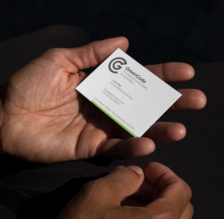
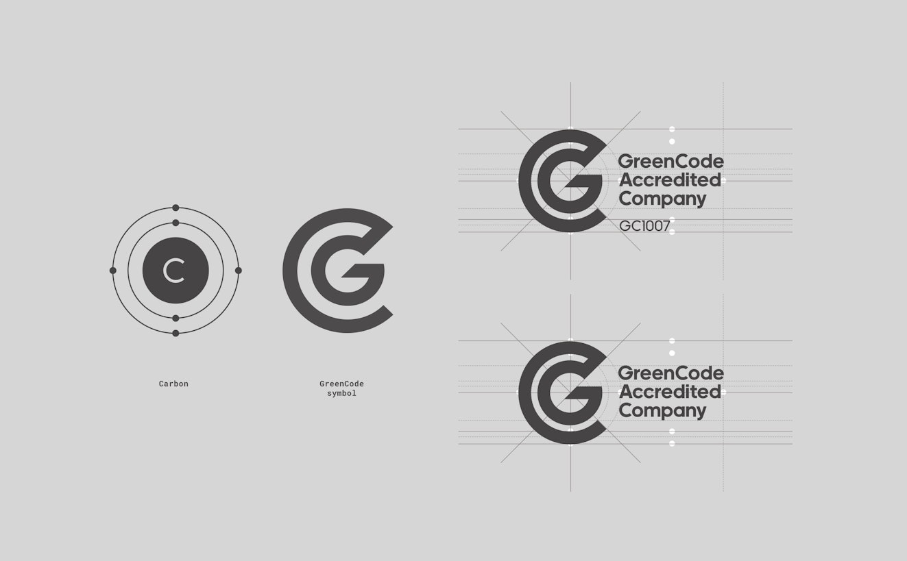
Part of operating as a sustainable business involves driving down carbon emissions and keeping them at net zero. After trialling a number of logo and logotype options a solution combining a G and C were developed based on diagrams of the carbon atom. Its inner electron orbit was used as the basis for the G, while around that the outer ring forms the curve of the C.
It was important for the emerging GC design to convey the brand values of credibility and simplicity, and to align with the wider eco-conscious principles of the new company. The logo needed to make an impact on its own, and be flexible enough to form the heart of the GC Mark given to organisations that successfully meet audit requirements. The form was tweaked, honed and tested with the wording for a balanced lockup participating organisations can display on their site.
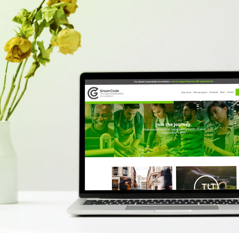
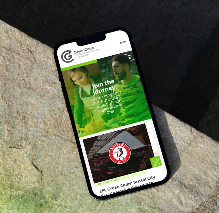
Alongside the development of the brand, Green Knight Studios built a pilot website introducing the concept to the market, explaining who it’s for, the processes involved and its governance. The site was evolved to become the enrolment point for GreenCode when it launched later in 2021.
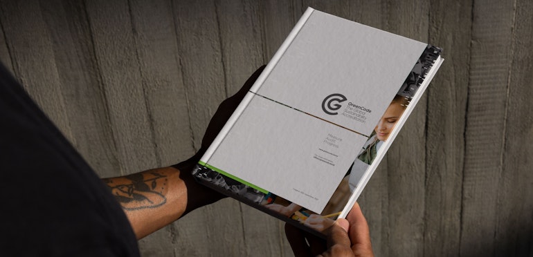
A layout, graphic, colour palette and typographic approach was devised to give the site its unique look and feel. This was transferred to all the documents, printed and digital, that GreenCode needed us to create for member organisations including:
- Questionnaire and audit documents
- Guidance booklets
- Partner packs
- Media packs
- Brochures
- Proposals
- Digital presentations
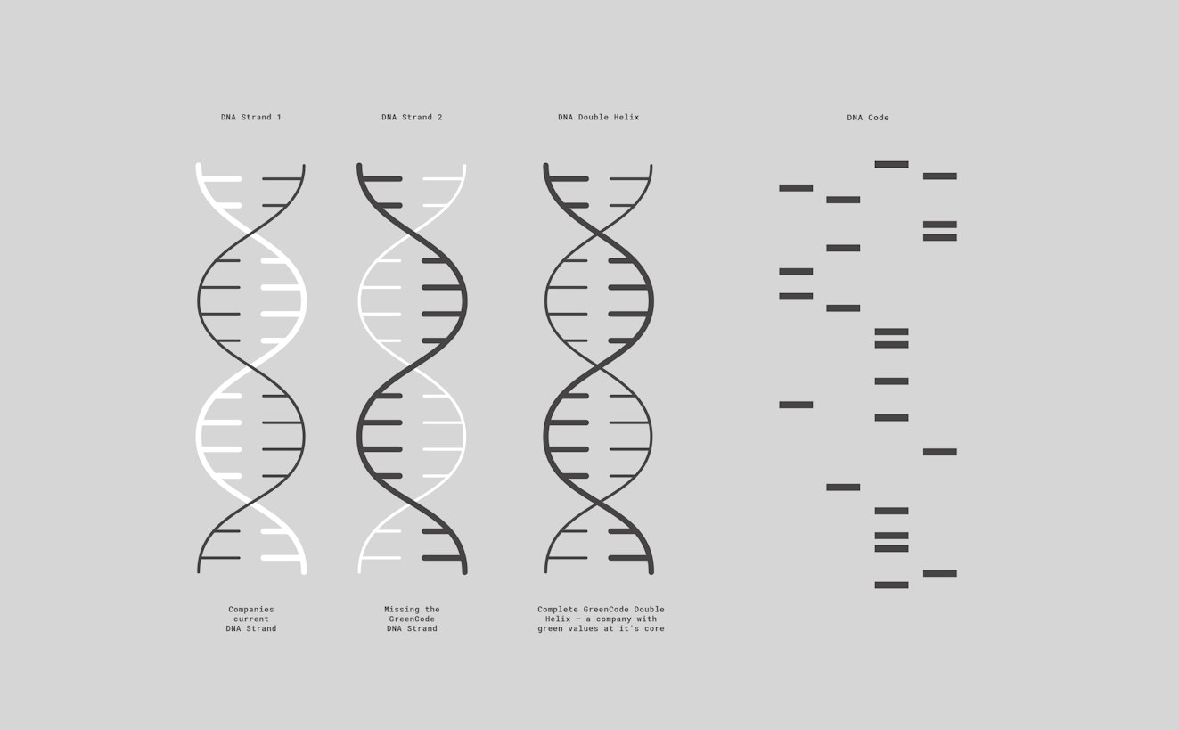
Subtly within the designs, double helix forms and the bars seen in DNA profiling appear as secondary brand assets, linking back to the original code concept. This provides a secondary layer of brand identity, creates visual interest in otherwise rather dry documents, and helps underpin GreenCode’s unique offer.
At the time of writing, GreenCode is supporting nearly 300 businesses and organisations on their journey towards sustainability.
View the website: greencode.world
Scope
Brand Creation
Brand Guidelines
Content Strategy
Copywriting and Tone of Voice
Iconography
Infographics
Photography Art Direction
Print Materials
Social media graphics
Website Design
Contributors & Credits
Copywriting:
Garrick Webster


1 / 4