
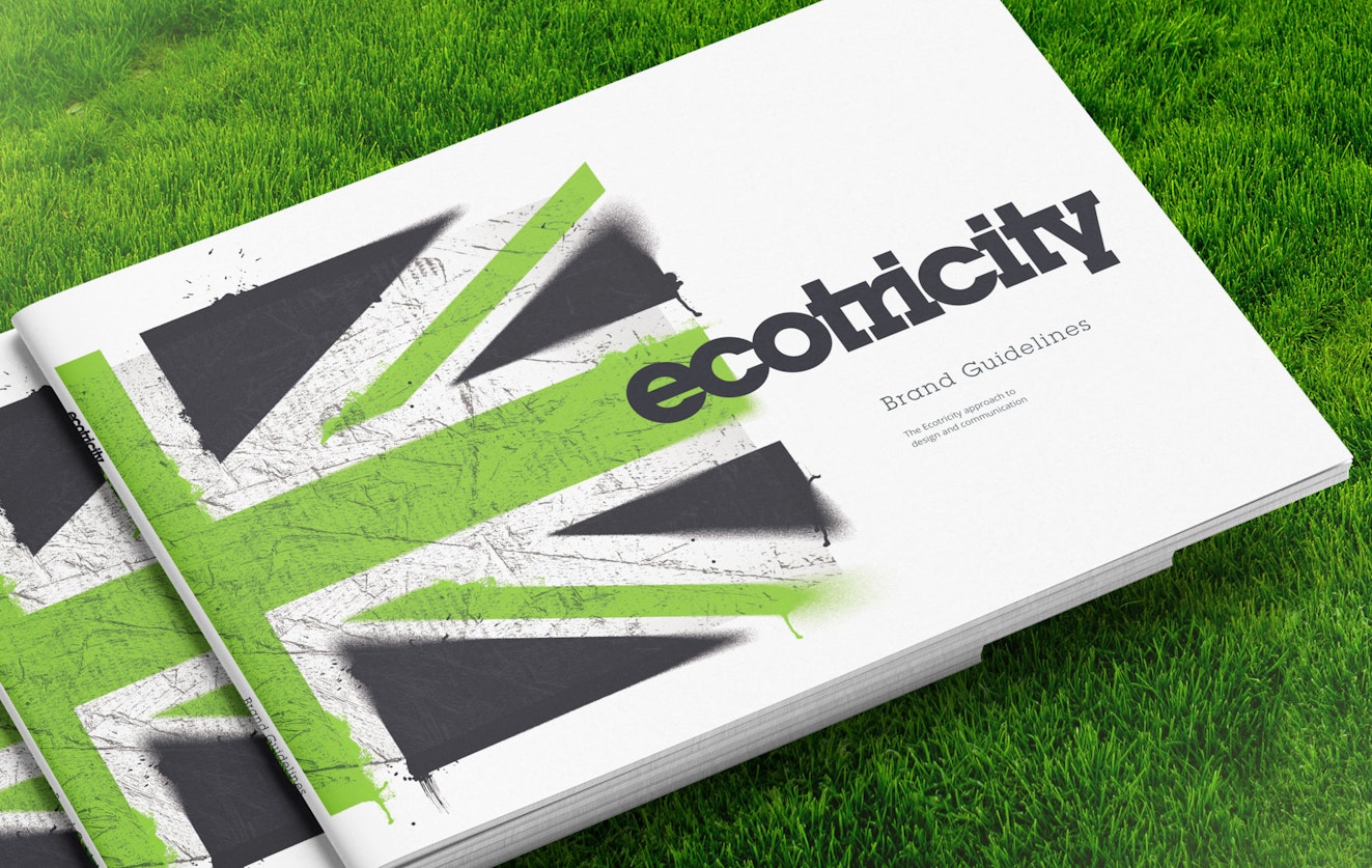
Ecotricity
Refreshing the brand and expressing its vision
As Britain’s first green energy company, Ecotricity already had a strong brand when its founder, Dale Vince, invited Green Knight Studios to update the identity.
There were two main pillars to the project – a refresh of the brand itself and a new website for the company to reflect this.
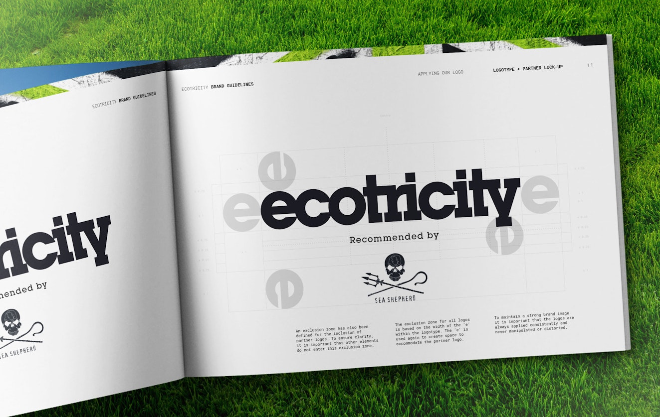
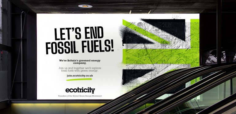
The Ecotricity logotype was redrawn to improve the flow of the characters, introducing better harmony and balance for a more crafted and considered form. Alongside this recognisable brand mark, the green union jack already associated with Ecotricity was developed to become flexible brand asset to be used in part or in full across a range of comms.
At the same time, we dived into a discovery process to learn more about Ecotricity’s past, its future direction and why it has so many longstanding customers. We researched the wider energy market to test how other companies were marketing green energy and understand what was working and what wasn’t.
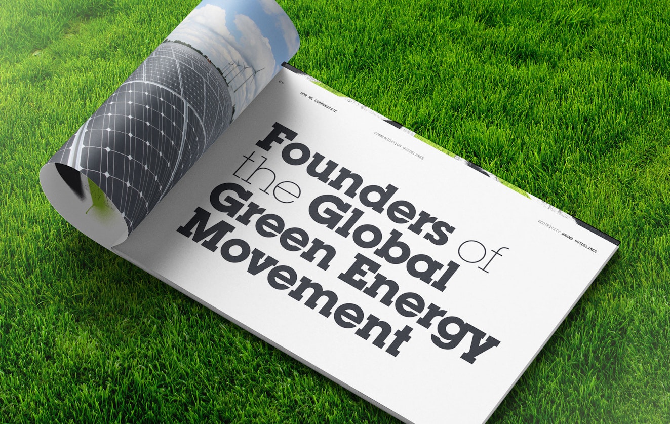
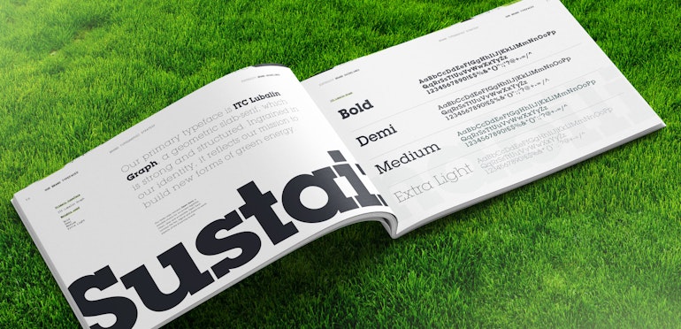
These insights informed the visual strategy for the brand, its key messaging and tone of voice. For the first time in its history, Ecotricity would have a single set of brand guidelines – a unified resource available to internal designers and agencies creating work for the company. This has enabled the brand to communicate its pioneering message consistently at all touch points.
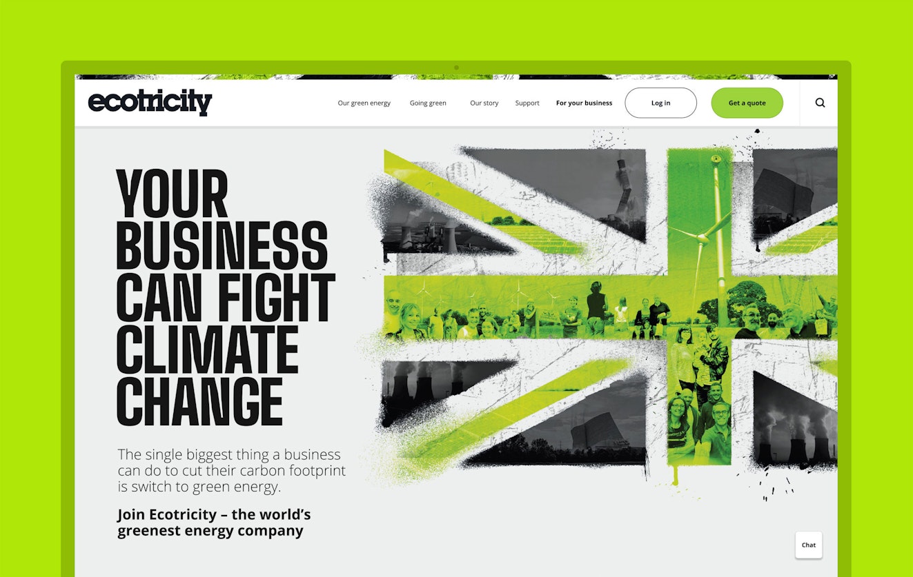
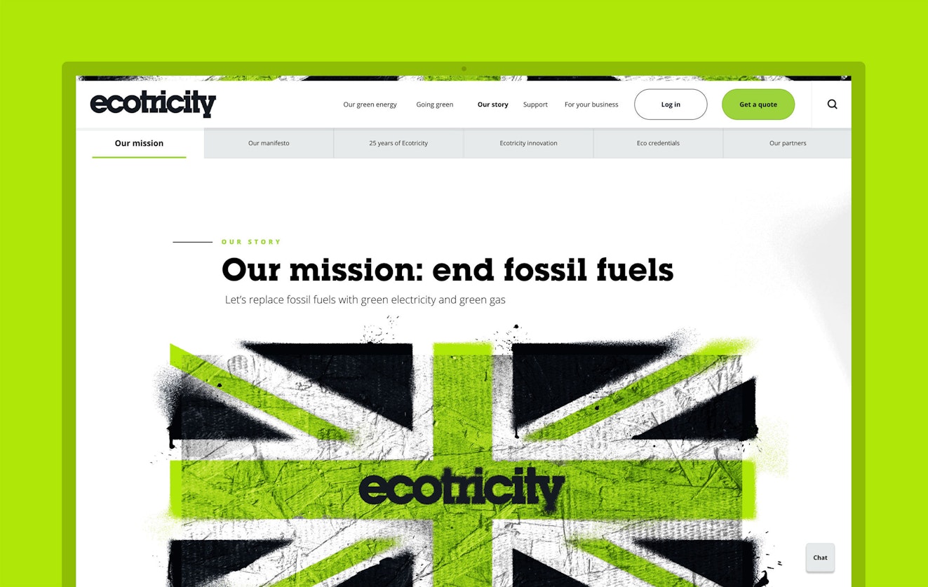
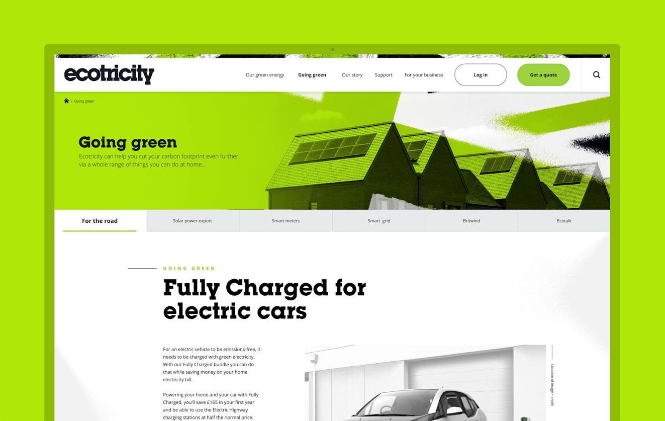
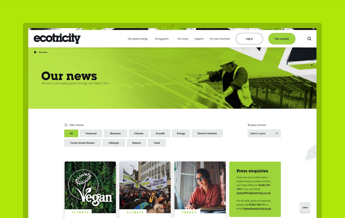
With an activist voice, the new Ecotricity website calls on customers to help end fossil fuels. In addition, the other key facets of the Ecotricity narrative are clearly presented on the homepage, based on a fresh information hierarchy developed for the site.
The company’s long and impressive history is now accessible through a visual timeline tool, while its values, track record and innovative approach are expressed interactively and in detail via an easy-to-navigate interface.
The company’s story and raison d’être are a critical part of the brand narrative, but on the website they are leveraged primarily to attract new customers. Green Knight Studios worked with the digital team at Ecotricity to improve the customer journey both in terms of new signups and via better online customer support.
All of this was carried out in a way that would ensure Ecotricity continued to appeal to both the domestic and business energy customers, effectively serving two very different markets.
Working closely with the teams at Ecotricity, Green Knight Studios is delighted to have introduced greater consistency to the brand. In addition, a website that was large and unwieldy is now clean and clear, structured to convey the brand’s powerful mission, its history of firsts in the renewable energy sector, and the benefits it offers customers.
View the website: www.ecotricity.co.uk
Scope
Brand Identity
Brand Guidelines
Content Strategy
Photography Art Direction
Illustration Art Direction
Iconography
Visual Language
Print Materials
Motion Graphics
Website Design
Website Development
Contributors & Credits
Photography:
Joby Sessions
Website development:
Rob Stanford


1 / 3


“Ecotricity’s track record is something we’re proud of. Green Knight has preserved this and turned it into a true asset when it comes to attracting new customers and retaining existing ones.”
Dale Vince OBE, Ecotricity Founder


1 / 4


